25 Conversion Rate Optimization Tips to Improve Conversions and Increase Revenue

This is the fourth post in our #SellMore series around Conversion Rate Optimization. We’ve explained why conversion rate is important for ecommerce, how to uncover and optimize your conversion funnel and how to retarget and re-engage those conversions you’re losing (yes, it’s happening to the very best of you). This week, we’ll be helping you fine-tune your online store’s conversion funnel in order to boost your conversion rate overall.
For the most part, it’s pretty apparent that the majority of online store owners focus on aesthetics rather than conversions. In other words, as you get started online, many store owners prioritize design over conversion funnel optimization –– and that’s ok. Design is a big part of optimizing for ecommerce conversion, but once you have the aesthetics out of the way, it’s essential that you implement additional conversion step functions to gain new customers and grow your revenue.
The goal of this post is to help you find and remedy the touch points you may have missed while working to launch your online store.
Conversion Tips: Open Up Communication with Customers
The beauty of an online store is that it can mimic an in-store experience. Better yet, it should mimic an in-store experience. Some shoppers will want to come to your site, browse and buy — without talking or messaging a single person. Other shoppers, however, will want to communicate with a brand representative just as they would at a brick-and-mortar. And, as customers become more and more loyal, they’ll want to be able to offer brand and site usability feedback on a regular basis.
The beauty of an online store is that it can mimic an in-store experience.
This is great news! You want your customers to be engaged with your brand, and it’s important that when they give you feedback, you not only respond to it, but you seriously consider implementing it. This increases customer loyalty and social proof, which in turn increases individual customer average order value (AOV) and net new customers.
Here are a few ways to generate customer feedback for your brand:
Survey website visitors: Place a survey on important pages on your store site to help understand customer needs. Based off of the feedback, tailor your business to your audience to better turn browsing visitors into converting customers. If you use a service like Omniconvert, you can integrate a survey into any page on your website.
Survey your customers: If you have a larger client base at your disposal, you should absolutely leverage that base to increase your conversions. This is a quick and targeted way to gain feedback and possibly uncover hidden conversion issues. Check out tools like SurveyMonkey, which is free and easy to understand, even for newbies. Plus, they have great advice on customer feedback and a survey writing guide that will help you ask the right questions to gain actionable data about your online business.
Tap social followers: Beyond posting your survey on social media channels, consider hosting a Twitter Chat. This tactic allows for you to directly communicate with highly-engaged customers and have a deeper discussion around issues or suggestions you find are a trend among your base. Additionally, monitor your brand mentions on Twitter. This will help you understand friction points around your business given that you’ll have the ability to see what prospects, customers and even your competition are saying about your brand. Using a platform like TweetDeck, which lets you set up multiple streams to follow mentions or keywords, you’ll be able to provide instant customer support to people having issues with your product or store. And, nothing brings back a customer more than stellar customer service. Check out Hubspot’s eBook How to Monitor social in 10 Mins A Day to get this implemented quickly.
Implement live chat: Live chat is not only a great way to replicate an in-store experience, but it’s also useful in identifying which issues people face within your conversion funnel –– in real-time. This insight can help you discover common patterns and frequent problems which can be shared with your development and marketing teams for further improving user experience and usability on your store. So, throw your concerns about who will man the feature or your dislike of the overall live chat aesthetic out the door and try one of these apps. If you already offer live chat or are thinking about adding it, don’t miss these 25 customer chat tips from Kevin Gao for KISSMetrics or live chat tips from our client Fugoo to get you started.
Encourage reviews: Make it easy for customers to review your product on your product pages, but be sure to take your social proof promotion to the next level. Send an email invite to customers who purchased a product, asking them to give feedback. You can automate these types of emails via ecommerce apps like Yotpo. Yotpo fully integrates with your social media feeds to automatically post a review to your channels for maximum marketing amplification. Collect these reviews and use them on your website, in marketing collateral like emails, store banners or a page dedicated to testimonials. A good review of your product or business is internet gold –– 79% of customers trust a customer review as much as a personal referral.
Polish Your Website Navigation
The objective of your top, side and footer navigation is to make your most frequently searched content easily accessible. By understanding what is important to your target audience, and intelligently crafting your navigation menu, you’ll be removing friction within your conversion funnel, which will help shoppers start shopping –– and fast.
Here are a few hard and fast rules for determining which site categories make the navigation cut:
Keep yourself out of the picture: Don’t create navigation categories just to create categories. Only include links your shoppers find valuable. This is not the time or place to rely on aesthetics or your gut feeling. Instead, use Google Analytics or your ecommerce analytics to determine your most frequently visited landing pages (i.e. Women’s, Men’s, New Products, etc) and then link out to those within your site navigation.
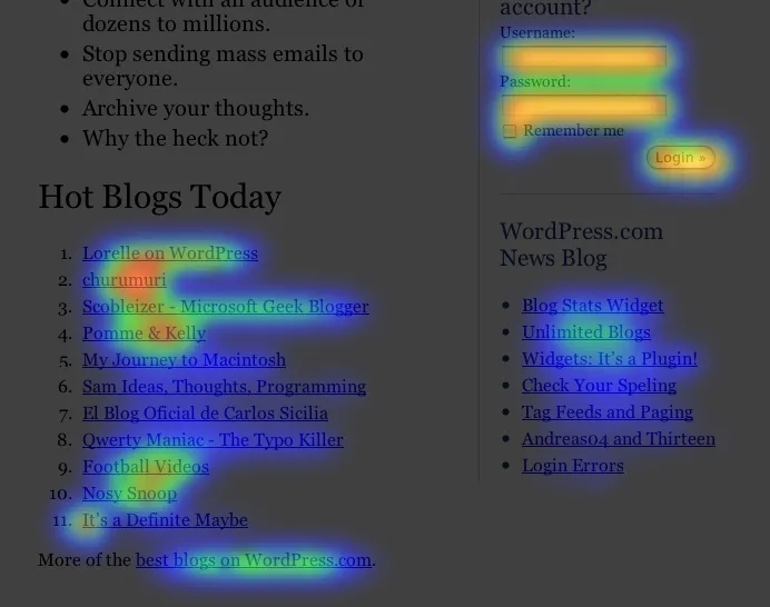
Use tools to avoid assumptions: Consider using Crazy Egg, a tool that provides heat mapping. Heat mapping is an insanely valuable way to better understand how a shopper uses your site. This type of information is extremely informative, especially when coupled with additional metrics regarding your online store, like in-store search and website exit rates.
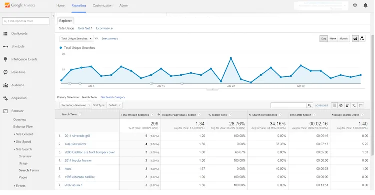
Create categories based on search: If you’re a Bigcommerce merchant, use your in-store search analytics to help determine what shoppers are looking for, then bring those categories front and center. If you’re not a Bigcommerce merchant or you’d like another look at what shoppers are searching for on your site, use Google Analytics: Google Analytics > Account > Behavior > Site Search > Search Terms.
Sort categories by popularity: The category links in the footer navigation should be in ascending order of their popularity. In other words, place the most clicked links at the top, and push the least clicked category links to the bottom. If you don’t want to sort by popularity, consider sorting alphabetically to allow shoppers to skim quickly while they browse.
Make Your Homepage an Open Door
When it comes to online shopping, you have about three seconds to make an impression. With that in mind, many store owners often overcrowd their homepage, which can make your site confusing or slow to load. Instead use your homepage space to optimize for conversions by keeping it simple and easy to navigate. Here are some key elements to think about:
Feature your top-sellers: Use analytical tools like Bigcommerce Analytics or Google Analytics to pull reports that help you determine which products or service in your catalog are performing best. Try to focus your marketing efforts in promoting your top selling products in banners, carousel sliders and recommended products areas throughout your website. These are most likely what potential shoppers are looking for (hence why they are popular).
“Add to cart” buttons: If you’re calling out your top sellers or a new product that has been added to your catalog, don’t forget to place an add to cart button directly by the listing so shoppers can skip right ahead to the checkout page. Better yet, implement the BigCommerce Buy Button, a customizable feature that allows you to add a clear CTA to your site as a card, button or link.
Include a carousel slider: Carousel sliders allow you to push shoppers to trendy or curated sections of your site. In general, these sliders link out to specific product pages or product roundup pages. They are different than what you call out in the navigation and are updated frequently –– whereas navigation pages are typically static. To create an optimized carousel slider, you only need three things: a compelling photo, enticing copy and a strong call to action. Check out this video to find some general carousel tips and tricks along with some specifics for using your Bigcommerce carousel.
Call out important information: Do you have some sort of sale or special offer? What about a great warranty or quality, low-cost shipping options? How about a new product your customers have been waiting for? What about an FAQ page or physical store-front? This is the type of information you’ll want to call out on your homepage and link to more information as relevant. Whatever is most informative, enticing or exciting to your customers should be front and center.
Keep “the fold” in mind: With the advent of responsive design, with which your site layout changes based on screensize, the old “above the fold” rule of thumb isn’t as applicable. In the print days, “above the fold” referred to keeping the most relevant information above the newspaper fold in order to optimize for people buying a copy. On a website, keeping something above the fold would mean to keep it high enough on the screen that a user doesn’t have to scroll to see it. With responsive design, however, “the fold” is never in a consistent spot. That said, you should still prioritize your information. Keep your new products carousel CTA at the top of your homepage, even on mobile, and push sales and discount codes further down the page. On mobile, a user will have to scroll to see any of your information (other than navigation), but the less they need to scroll, the more likely they are to click.
Take a 5 second test: Be sure to test your website to get a shoppers view at your store. Use this 5 second test to understand exactly how your site is being presented to a customer during those critical first seconds.
Beef Up Your Product Pages
Product page optimization is arguably one of the more important aspects of your online store and there are plenty of ways you can tweak and test these pages to increase your store revenue. In all, there are three main elements to consider: selecting the right colors, include the best call to action and labor over your layout. The following items also help to fully optimize your product pages:
Craft product descriptions that sell: Having a great product description for each of your products is critical if you want your shopper to press that “add to cart” button. Writing product descriptions can feel overwhelming but it’s really just about highlighting the features and functionality of your product or service and explaining how they benefit your customer. Keep it simple and skimmable. Also, don’t forget to include or link out to things like your shipping & returns policy, FAQ pages, product reviews, sizing carts, or whatever is needed or helpful to communicate details around your offering.
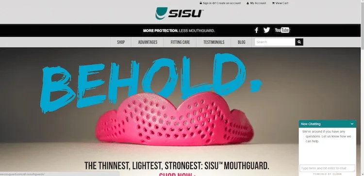
Have clear product options: Be wary of creating multiple pages of similar products, where the only difference is a variant like color or size. Google’s search algorithms often count this as duplicate content and will penalize your site accordingly, lowering your overall SEO. Instead, include variants of your product on a single page for a better user experience. Check out how Up Lift Desks allows customers to build their own desk via product options or you can keep your product pages simpler like Sisu Guard by altering your product images based on a shopper’s selection of your product.
Take amazing product images: 67% of customers rank image quality as “very important” when deciding whether or not to purchase from an online store. What’s more is that, according to an eBay study, each professional product image that is added to a particular listing increases sellers’ percentage of making a sale by 2%. So, here are some resources to help you amp up your product photography and ultimately optimize them for conversion:
Showcase product videos: Video helps communicate details about a product and sets the proper expectations around your product or service. Beyond just increasing conversions, product videos, or even a great business video, can help increase brand awareness and customer satisfaction. Check out some of these video examples from online stores including Two Guys Bow Ties and KBands Training.
Make your prices clearly visible: Although you may not want to make your product or services’ price the main focus on the page, you don’t want to hide it, either. Pricing strategy varies depending on the type of business, but if you’re running store that touts its prices as a selling point, like online store 33off.com, you may want to actually call your product prices out to help increase conversion.
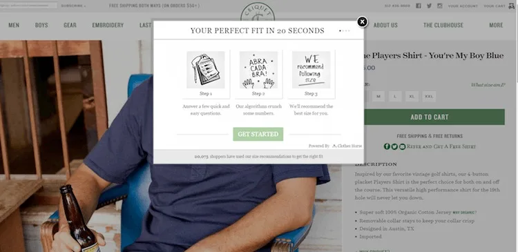
Include charts and calculators: There are many types of charts or calculation tools that you might want to offer to enable shoppers to find the exact specifications they seek. These are great at helping to answer common questions about a product or service including concerns around size, shape, fit and shipping estimates. Check out this example from Criquet Shirts, below:
Out of stock notifications: Be sure to sync up your inventory and your online store. When a product is out of stock, absolutely showcase that on the product page itself. This creates a much better customer experience (rather than them putting something in their cart only to find out it was never available) and serves as a proof point of a highly-wanted item. You can also use your product pages to alert shoppers to how many of a certain product are left (if there are only a few) and even add an “email me when this item is restocked” option. This way, you bring those potential customers right back to your business to buy.
Improve Your In-Store Search to Increase Conversions
An inaccurate or dysfunctional product search, also known as in-store search, can hurt your business in the form of lost sales, especially when the size of your inventory exceeds the scale at which it can be browsed. Although you may have complete control over your Bigcommerce in-store search functionality, if you’re not a Bigcommerce store owner, you can use Google Analytics (Content > Site Search > Usage) to gauge whether or not users are actively using product search, and how each search is converting.

Here are a few best practices to get you started:
Make sure your search function is displayed: Most ecommerce design themes already do this, but if you’re noticing shoppers are not using this feature, you may want to test displaying it more prominently.
Test for accuracy: Search both singular and plural keywords to make sure the results provided actually make sense and are helpful to the end-user.
Implement auto-suggestions: Show keyword recommendations as the shopper is typing into the search field. This is a great way to showcase some of your other product options and can help customers find what they are looking for without having to completely type in the entire phrase.
Thanks for reading! Stay tuned for our next #SellMore post or discover some advanced conversion tips to increase your company’s ROI. If you’re a BigCommerce client and want to ask specific questions about your business and gain insight from our experts, click on the link below. We’d love to help you sell more!

Katey Ferenzi has lived and breathed ecommerce for +10 years. In the mid-2000s, she and her husband started their own online business and successfully exited so they may come to Bigcommerce to teach other SMBs how to do the same. Currently, she's consulting for Jasper PIM, a Product Information Management (PIM) solution focused on unifying back-office operations with front-end shopping experiences for mid-market and enterprise businesses looking to scale.

