The Power of Popup Design: 6 Rules to 10X Your Subscription Rate, and an App to Do It for You

There are two things you absolutely MUST do as an online store owner:
Get people to visit your store.
Do everything in your power to turn those visitors into customers.
The former usually requires a fair chunk of time and money, which puts even more emphasis and importance on the latter.
It’s not enough to just have quality products and a good-looking storefront: you need to engage your visitors and stand out from the competition.
One of the most common ways online stores engage customers is with popups and banners. These on-screen interactions aren’t so different from a sale sign in the front window of a brick-and-mortar store, or a sales clerk asking if you’d like to join their loyalty program.
Popups aren’t a recent invention, of course.
The first popup ad flashed onto the scene in the mid-’90s, and since then online marketers have weighed the downsides of using popups — annoying customers, interrupting user experience, even slowing down page speeds — with the fact that popups are really, really effective.
How effective?
One study found that switching from a sidebar form to a lightbox-style popup design increased email signups by 1,375%.
One study found that switching from a sidebar form to a lightbox-style popup increased email signups by 1,375%. Another business tried using a popup to capture email signups and saw a 10x increase in subscription rate.
Whether you’re a fan or not, using popups is a surefire way of attracting visitors’ attention, whether it’s to collect an email address, promote a sale, or something else. Even the ugliest popups generally convert well — which is why nearly every website uses them.
While popups aren’t a new phenomenon, what is relatively recent is the development and proliferation of more elegant, more manageable popup solutions.
In 2017, not only do users expect to see popups when they visit websites, but marketers, including online store owners, have tools for creating popups that look great and serve their customers’ interests.
That last point is key to using popups well, and it’s something we’ll expand on later in this post when we share some best practices for using popups in your store.
For now, just remember that popups should always offer the customer a benefit. As an online store owner, if you don’t have a mutually beneficial reason for showing a popup, then it’s probably not worth it.
If you don’t have a mutually beneficial reason for showing a popup to a customer, then it’s not worth it.
When we designed Pixelpop, our goal was to give online businesses a way of doubling down on the world-class customer experience we had in mind when we designed all 67 Stencil themes currently in the BigCommerce theme store. We wanted to help merchants get the most out of every person who visits their store, whether that means converting them into sales now or collecting their email to increase the chance of converting them in the future.
In the end, we built a popup app that’s incredibly easy to use, and that makes it easy for any store owner to create an assortment of great-looking popup designs and banners designed to engage visitors, boost conversions, and drive sales.
Over the past year, we’ve thought a lot about what it means to create a winning engagement strategy, from the popup types and options you should consider, to exactly how to match your popup to your brand and BigCommerce theme.
In this post we’ll share what we’ve learned and give you the tools necessary to make sure you’re engaging every visitor in the best way possible.
Get Started Now
Check out Pixelpop in the BigCommerce App Store.
Rule #1. Start collecting email addresses
If you’re already doing this, kudos! You’re off to a great start.
If not, now is the time to add Pixelpop to your store (it takes two seconds) and create an email signup popup. Go on, add the app right now. We’ll be here when you come back.
Here’s what it should look like right before you launch.
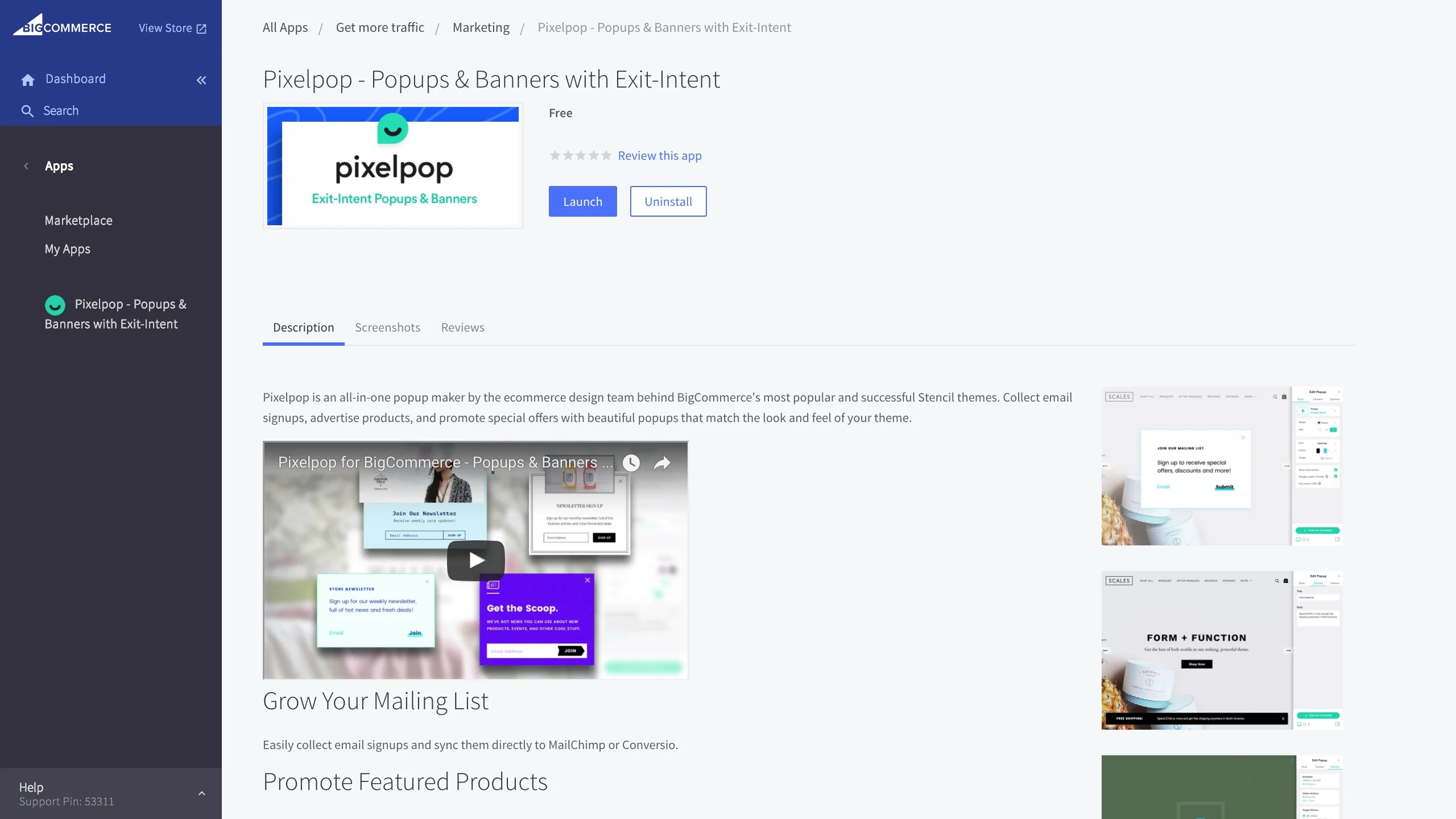
So why is collecting email addresses so important? For one thing, no matter how great your products are, no matter what special deals you’re offering, you’re never going to convert every shopper who visits your store.
The vast majority are going to poke around for a bit, see what you have to offer, and then bounce off in search of the next great deal.
By using an email signup popup, you give yourself a chance at re-engaging those visitors and selling to them in the future — not just once, but over and over again.
And if you’re one of those people who believe email marketing is dead? Consider this:
66% of online customers have completed a purchase as a result of a marketing email
Email prompts purchases at 3 times the rate of social media
72% of people prefer to receive promotional content through email (compared to 17% who prefer social media)
The point is, if you’re not using a popup to collect email addresses, you’re missing out on a big opportunity and an even bigger chunk of sales.
In 10 minutes, you can create an email signup popup and sync it to MailChimp or Conversio so that signups are automatically added to your mailing list of choice. If you use a different email service provider, you can also download a CSV file with collected email addresses.
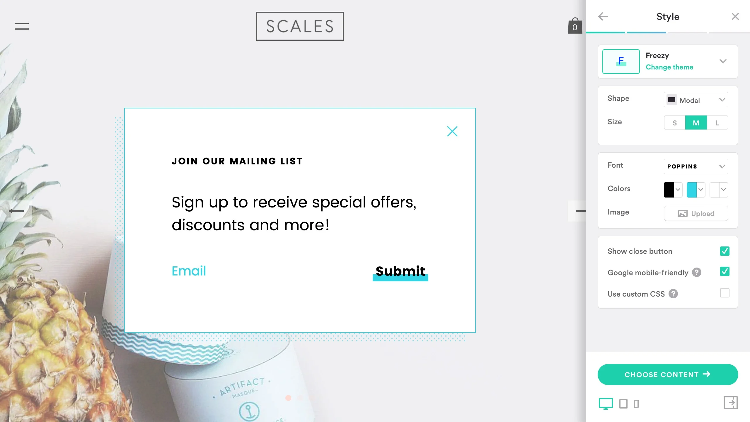
Easily style your pop-up to fit your brand and needs.
When the busy shopping periods hit and it becomes even more expensive to acquire traffic, you’ll be glad to have a list of customers who are familiar with your brand and products, who you can target with specialized sales and offers.
Rule #2. Run popups with planned campaigns
Pixelpop supports more than just email signups. In fact, it offers 7 popup types in total:
Email Signup
Announcement
Page Promotion
Coupon Code
Social Follow
Custom Image
Cookie Disclaimer
Now, you’re obviously not going to run all of these things at once, but you can pick and choose what and when to promote, and how to work popups into your various campaigns.
Free Shipping Banners & Popups
For example, if you offer free shipping, it’s always a good idea to announce that loud and proud at the top or bottom of the page. BigCommerce themes offer a built-in banner area that works well for this, but its customization is rather limited compared to the diversity of options supported by Pixelpop.
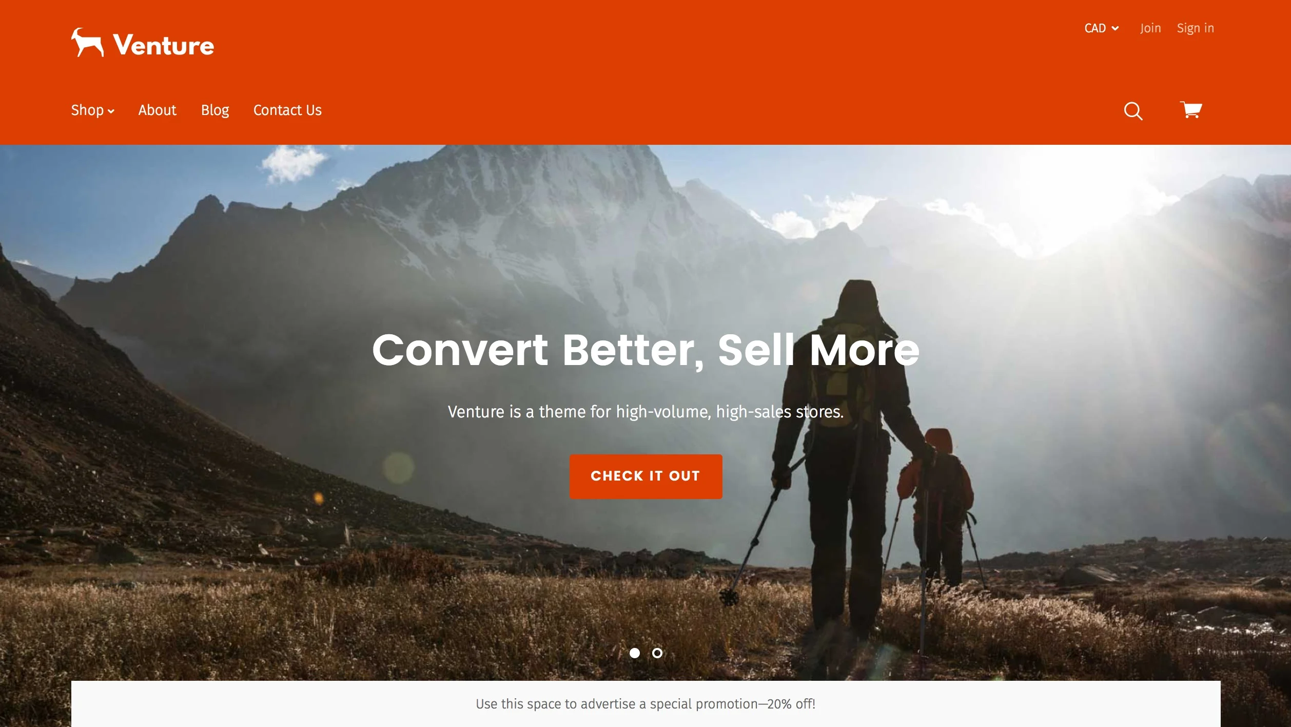
You can see the built-in BigCommerce banner at the bottom of the above screenshot.
To create a shipping banner that really grabs customers’ attention, you’ll need a solution from the app store. There are standalone apps dedicated to this functionality, but with Pixelpop all you need to do is create an announcement popup and select “bar” when picking your shape.
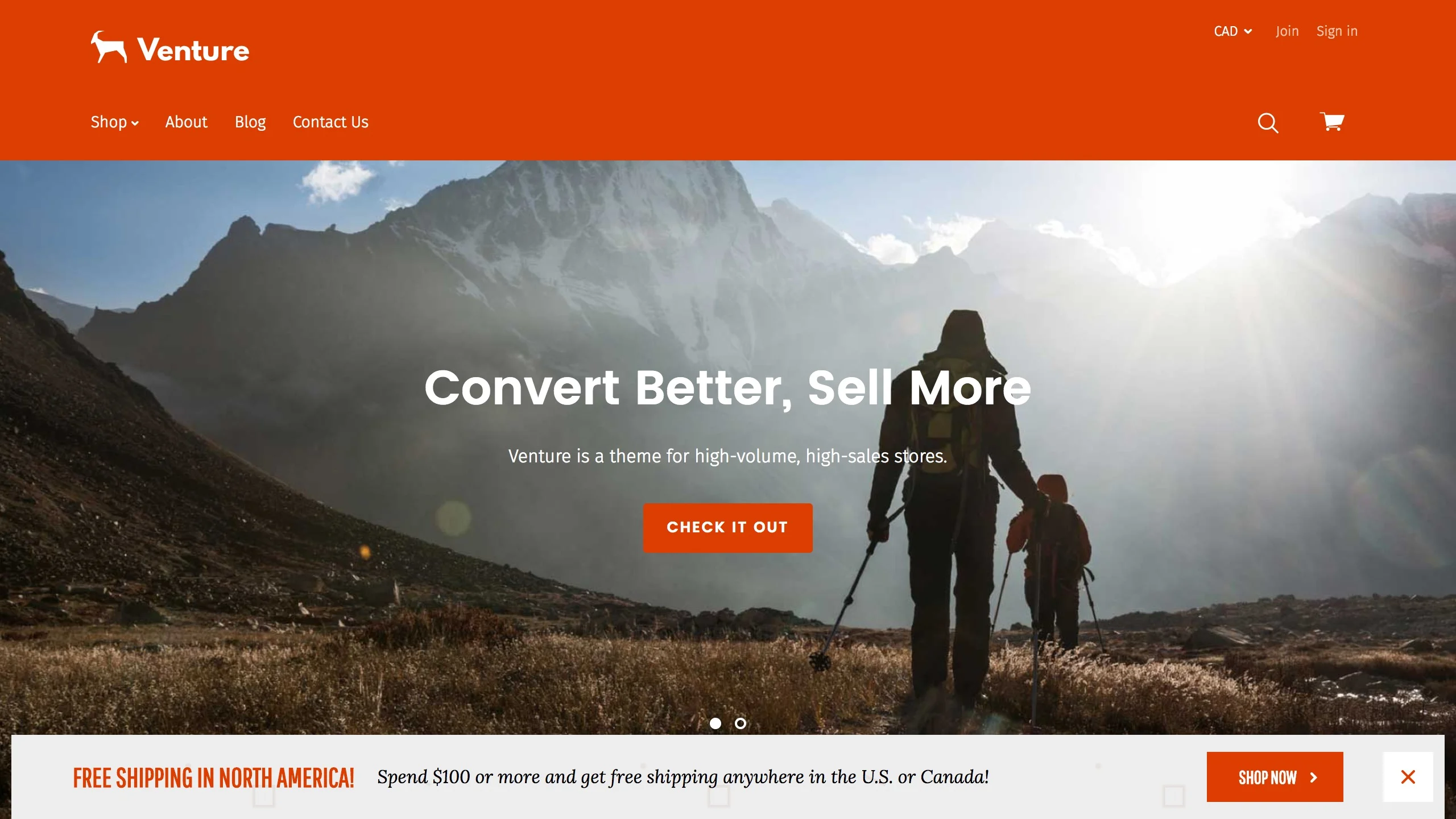
The Pixelpop version of a banner on a BigCommerce store. These can replace the out-of-the-box banners.
Can you afford to offer free shipping?
If you don’t offer free shipping, you should take a moment to consider if it could be a good option for your store. Start by calculating your average order value for the past few months, increase that by 10-20%, and try offering free shipping on any order over that amount.
Sales & Promotion Banners & Popups
Similar to free shipping, if you’re running a holiday sale or any other promotion, you’ll want to make sure visitors know about it the moment they land on your page.
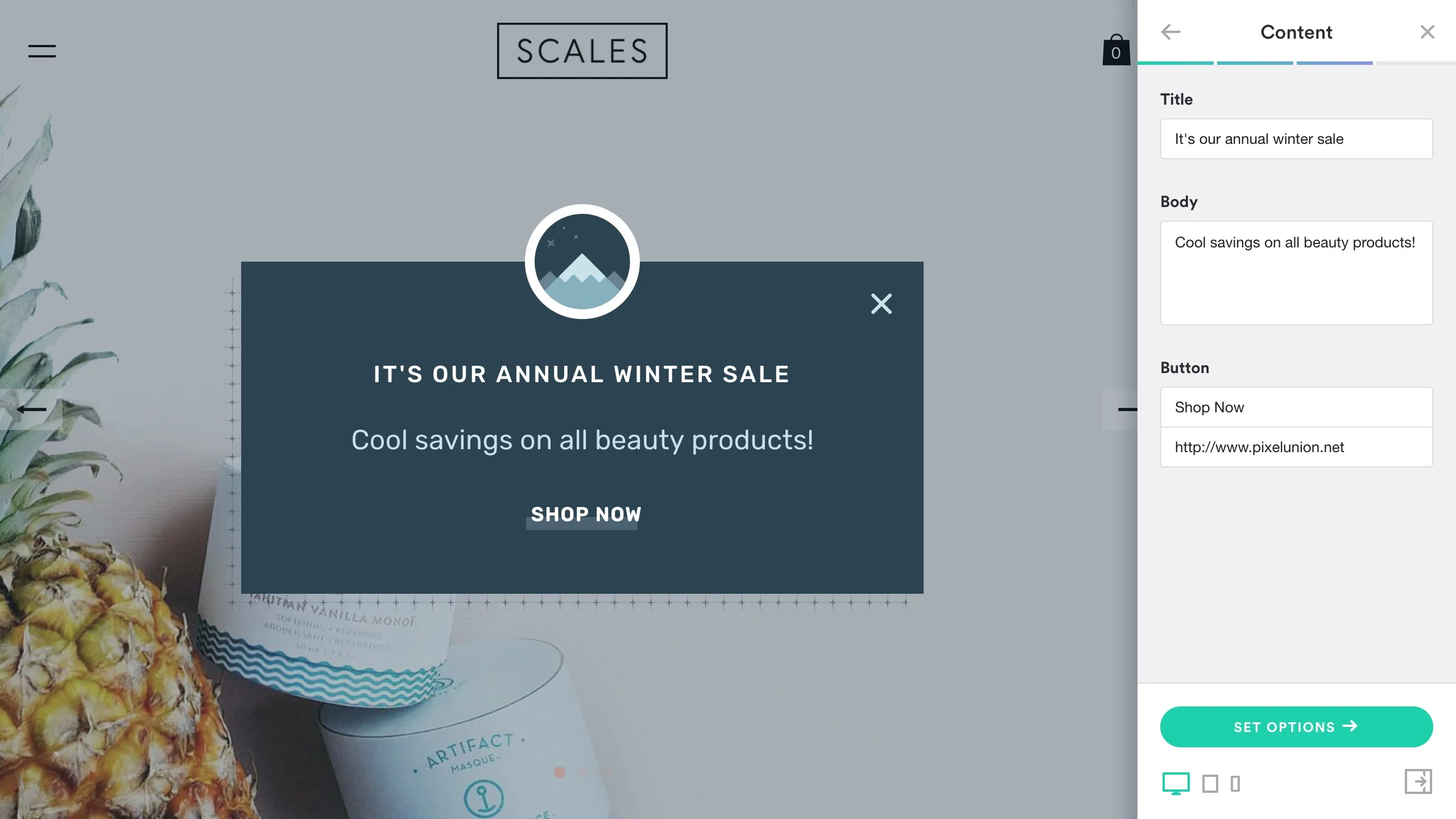
Using a page promotion popup, you can direct traffic to a featured or discounted product page, or even a special piece of content like a sales page or gift guide.
Here’s an example view while the pop-up is in build mode.
Coupon Code Banners & Popups
96% of U.S. shoppers say they look for and use coupons.
The coupon code popup is also ideal for promotions, as it displays a coupon code that visitors can use to get a discount at checkout. (And if you don’t believe in coupons, consider the 96% of U.S. shoppers who report using coupons!)

You can create pop-ups that take up the entire screen, but still mesh with your brand.
Versatility was key when we were designing Pixelpop. We wanted to give merchants an all-in-one tool they could use in conjunction with every campaign, whether that meant building their mailing list, getting more social followers, or clearing out inventory with a weekend sale.
If you’re doing something special for your store, don’t just sit back and expect customers to find out about it. Create a popup and deliver your message loud and clear.
Rule #3. Time your popups effectively
Before publishing a popup, review the settings available and make sure each popup is appearing in the right place, at the right time. Pixelpop offers a range of scheduling and delay options, which you can use to refine your engagement strategy.
Here is what that interface looks like:
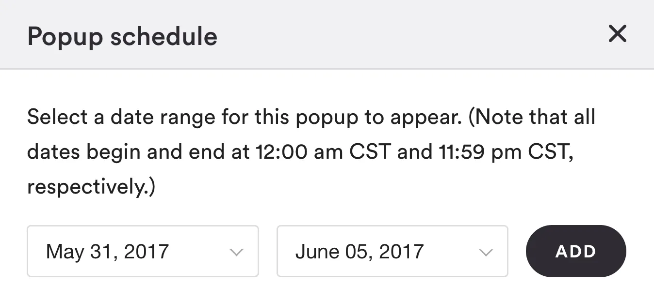
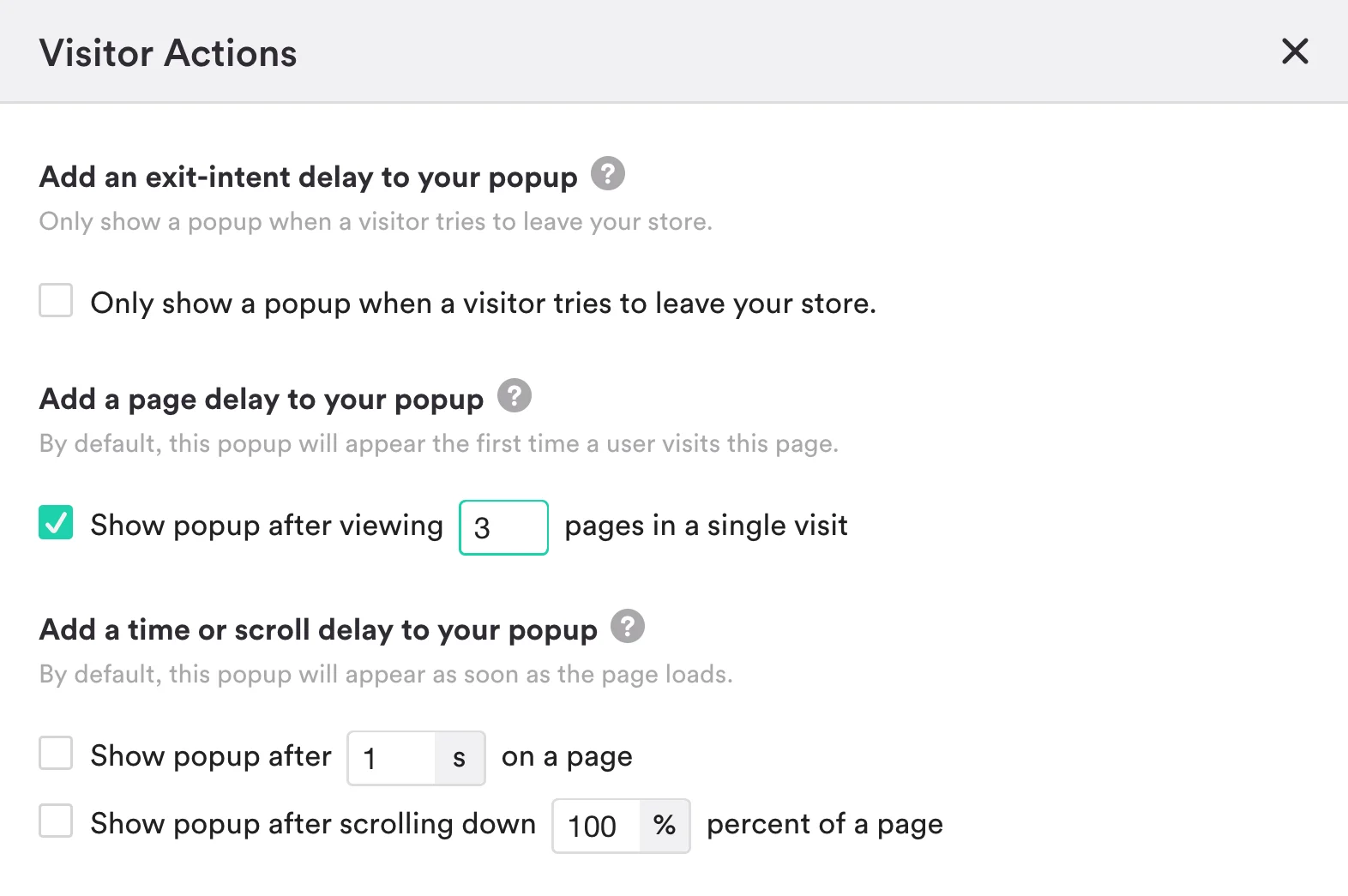
Scheduling is simple enough — choose a start and end date for your popup window to appear — but there’s plenty of room for finesse when it comes to delays.
With Pixelpop, you have your choice of several types of delays, including page delays (number of pages viewed), scroll delays (percentage of page scrolled), timed delays (amount of time spent on page), and every online marketer’s favorite: exit-intent delays (we’ll explain those in a sec).
Using a slight delay gives potential customers a chance to see what your store is offering before you try to sign them up for anything.
In the case of sales and special offers, you generally want to show those popups as soon as possible, which means not using any delays. However, with other popups, such as email signups and coupon code offers, it can be better to hold off for a little bit or use an exit intent popup strategy.
Using a page delay of 2-5 pages, using a scroll delay of 60-70%, or using a timed delay of 10-20 seconds is a good way of letting your visitors look around before asking for their email address. Using a slight delay gives potential customers a chance to see what your store is offering before you try to sign them up for anything.
Exit-Intent Popups
Delaying a coupon code popup is a similar way of building incentive, and it’s also a perfect use case for the much-ballyhooed exit-intent popup. If you haven’t heard of these little beauties, basically what they do is wait until the last possible moment before the visitor is about to leave your store, and then pop onto the scene in all their conversion-driving glory.
Here is an example:
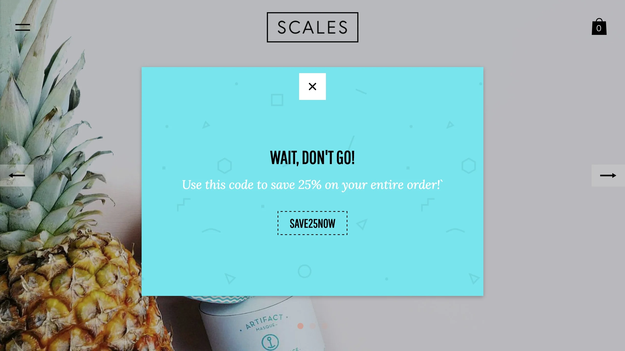
The reason exit-intent works so well with coupon code popups (and email signups, for that matter) is because you give the visitor the maximum amount of time to get interested in your products without interrupting their experience, and then, right when they’re about to leave, you get a perfect opportunity to convert them.
In a brick-and-mortar world, that would be like having a clairvoyant sales associate who knows exactly how long to leave the customer on their own before engaging them with an offer.
So how effective are exit-intent delays?
Consider that the current global cart abandonment rate hovers somewhere around 77%. Studies have shown that exit-intent offers can recover a significant chunk of lost sales by convincing shoppers to stick around or come back later with a special coupon code or email marketing campaign.
Try creating a coupon code popup in the shape of a “full-screen takeover,” enable exit-intent to offer customers a 10% discount, and see what kind of conversion lift you get.
How Much More Can You Make?
Use this free Abandoned Cart Calculator to see how much more money you could be making if you could email customers to drive them back to purchase.
Rule #4. Use advanced targeting for even better results
Speaking of refining your engagement strategy, you can tailor popups for certain audience segments. If you want to only show it to people from a certain country, or only on certain pages, or only to people arriving from a certain email campaign — more power to you.
There’s lots you can do with Pixelpop’s targeting options. If you want to customize your messaging or offers for different global audiences, or run regional sales based around national holidays (Cinco de Mayo sale, anyone?), you can enable geo-targeting with the “Target by location” option.
Here is what that interface looks like:

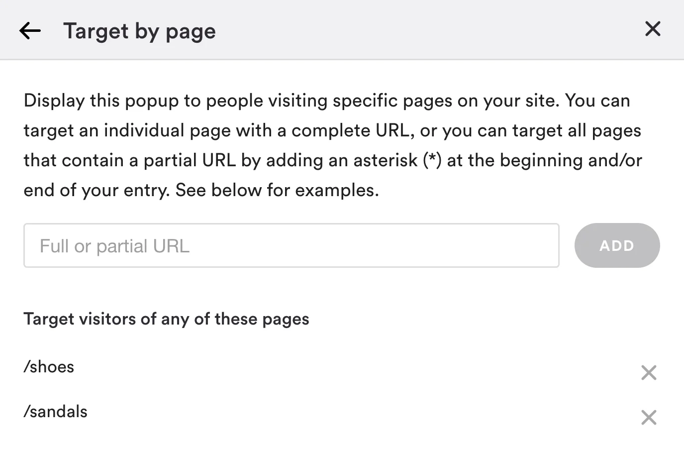
If you want to draw attention to a sale on a individual product, you can create a special popup that appears only on that product page using the “Target By Page” option.
Again, here is what that interface looks like:
One highly effective way you can use advanced targeting is with the “Target By URL/UTM Parameter” option. What this means is the popup will only show to customers arriving at your site from a specified URL (or partial URL).
If your customer is arriving from an email or ad campaign, you can use a banner or popup to welcome them to your site and reiterate an offer or promote a product they’ve seen before. This creates a more cohesive link between your emails, ads, promotions, etc. and your online store – and often increases conversions.
And again, what the interface looks like:
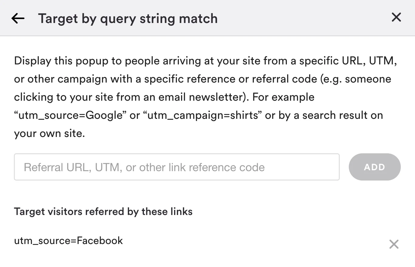
Next time you send an email to your mailing list, create an accompanying popup with a coupon for 10% off as a thanks for being a loyal subscriber, and add a UTM parameter which you can then paste into your targeting options.
Similarly, if you’re running an ad with a specific product featured in it, create a popup on your store advertising a discount on that product, and then attach a UTM parameter to both your ad and your popup’s targeting options.
Rule #5. Match your popups to your theme
One of the best things about Pixelpop is its rich, easy-to-use popup editor that lets you pick from a range of popup themes and custom fonts, colors, shapes, sizes, and styles. A live preview lets you see how your popup looks in your store as you edit it, including the option to preview what it looks like on mobile devices and tablets.
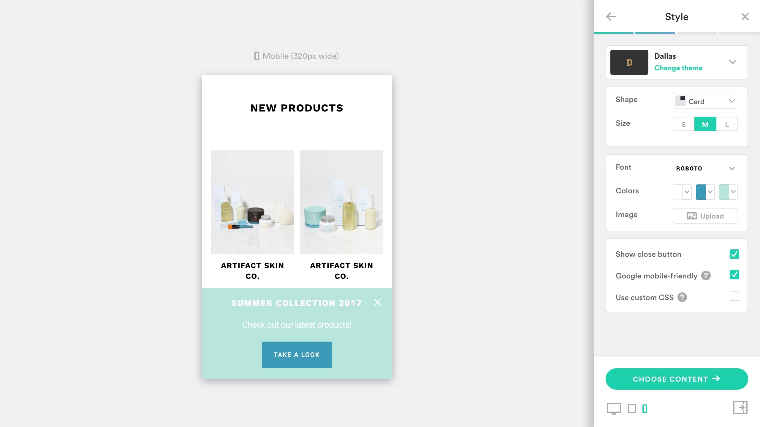
Easily customize your pop-up to match your site’s theme and branding across all devices.
If you’re a Stencil user, all the better, because now is a good time to remind you that Pixel Union, the ecommerce design agency behind Pixelpop, is the same team that designed all 67 themes currently available in the BigCommerce Theme Store.
What that means is you’re working with the very same design ethos that went into creating your BigCommerce storefront. Not only that, but you have access to Pixel Union’s customer support team, the same nice folks you would contact if you ever needed help with your theme.
If you’re a Blueprint user, don’t despair: Pixelpop is fully compatible with all Blueprint themes, and its versatility makes it easy to boost engagement with a popup that matches your store.
Which Popup Styles to Use with Your Stencil Theme
On that note, picking the right popup design for your store is important. Take an image-heavy theme like Geneva or Lookbook, for example. To complement its full-width design, you’ll want a clean, crisp popup that doesn’t detract from your beautiful product photography. A solid black or white background, depending on the tone of your images, is always a good call.
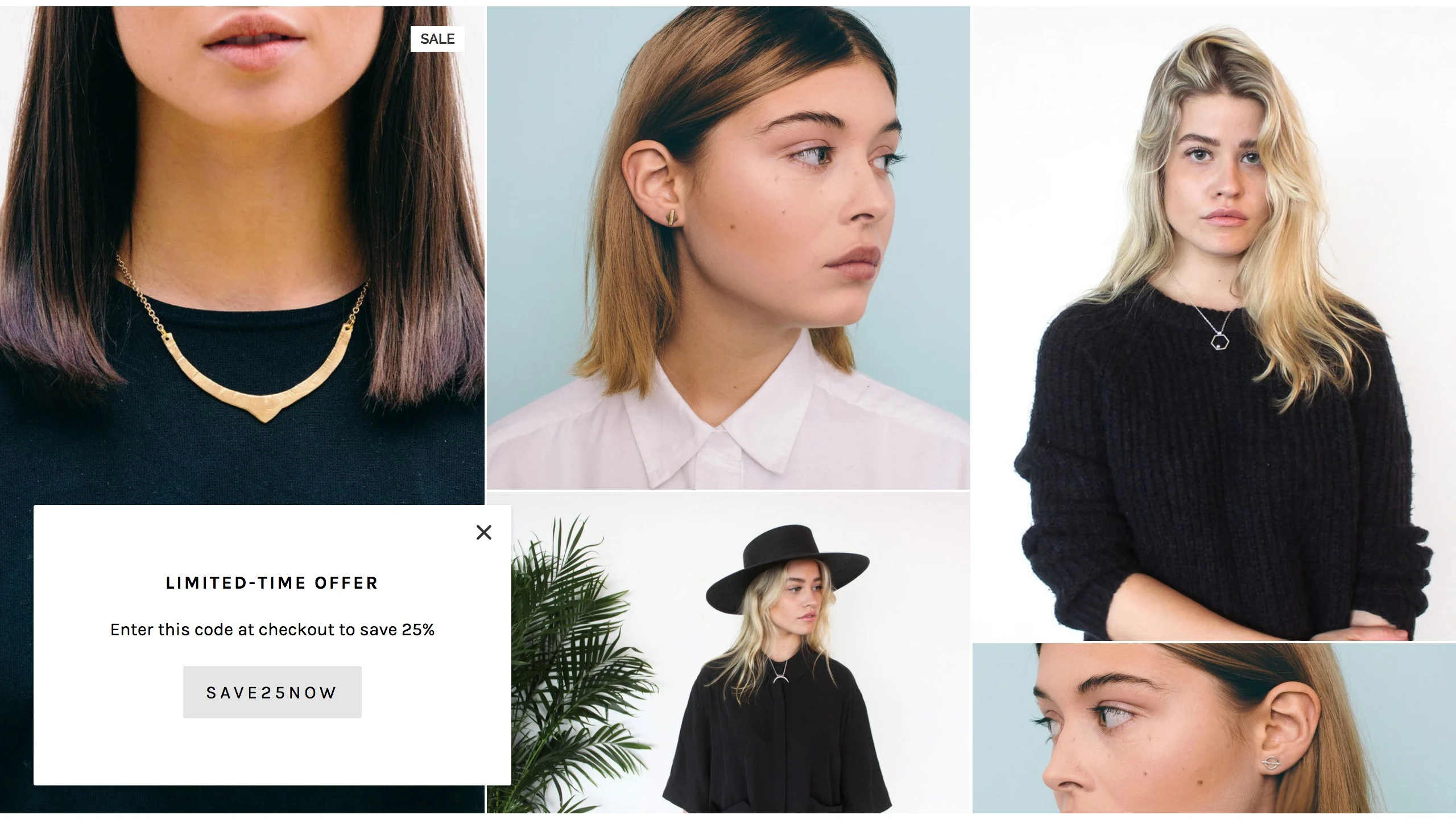
On the the other hand, if you use a more classic, grid-based theme like Foundry or Venture, you can be a bit more daring in your popup design. You still want it to complement the page’s fonts and colors, but don’t be afraid to design a popup that grabs the customer’s attention.
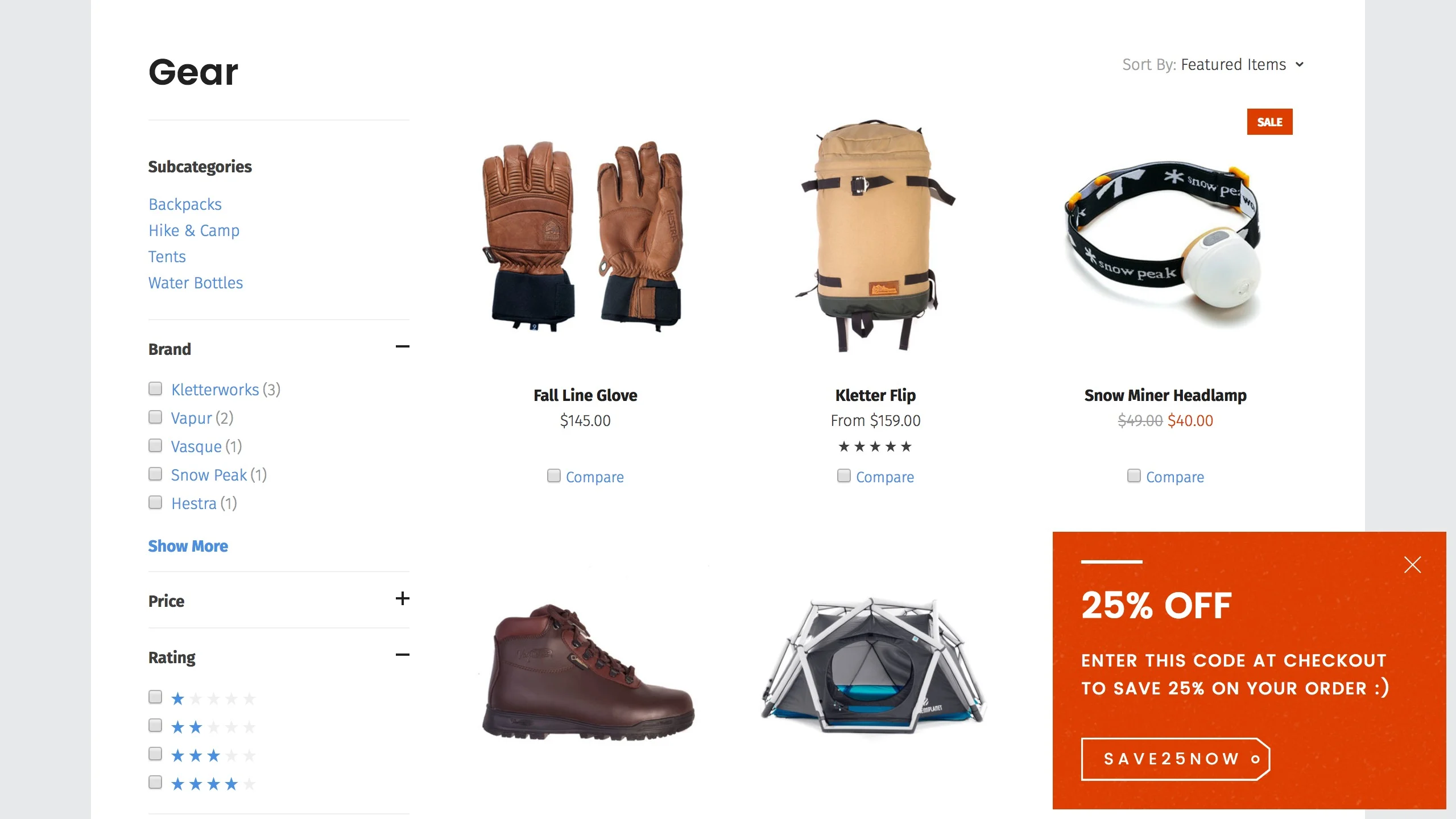
Also think about where on the page your popups appear and how that will affect your theme. If you use a theme like Merchant, which has a modal-shaped feature area and CTA button designed right into the carousel, avoid modal-shaped homepage popups and stick to bars, cards, and full-screen takeovers.
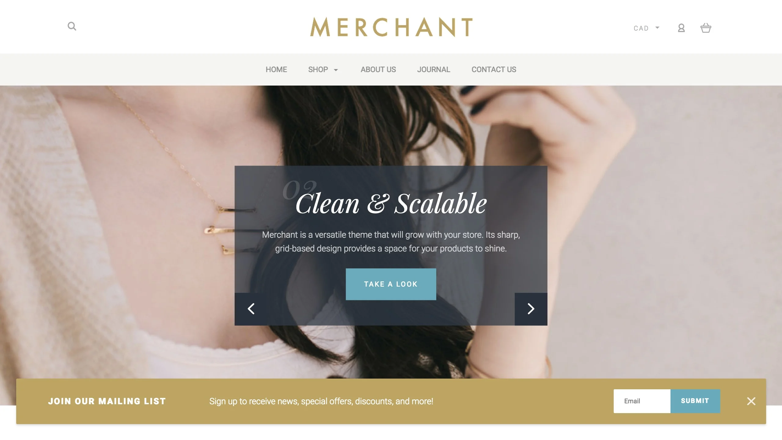
Conversely, a dual-column theme like Capacity is perfect for a nicely designed modal.
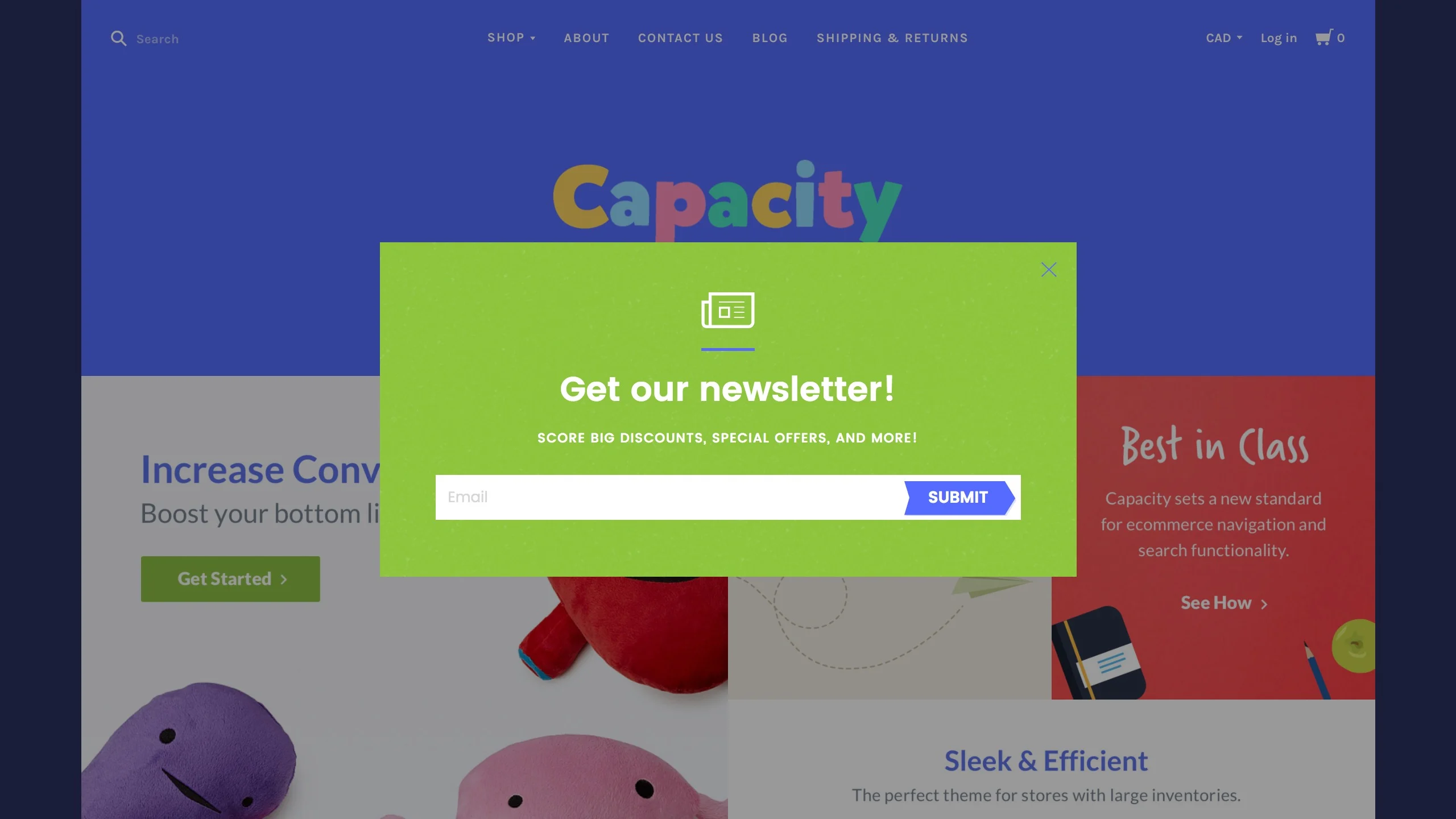
Pixelpop’s full-screen editor features a color picker with hex code support so you can easily implement your brand’s color scheme. Every popup theme also comes with an assortment of hand-picked font options, so you can find one that complements your theme.
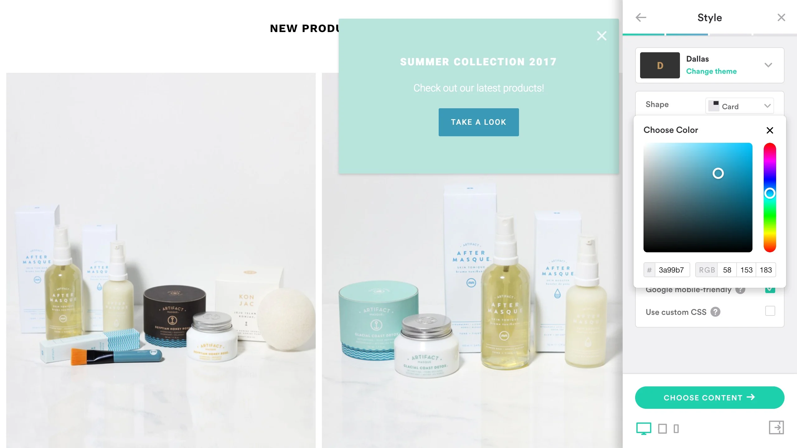
At the end of the day, you’ll dramatically improve your customers’ experience and build trust by making sure your popups look professional and match the look and feel of your store.
Rule #6. Follow best practices for creating popups
Before we sign off with our final call to go try our popup maker, Pixelpop, (that one doesn’t count), we thought we’d lay down a few final ground rules or best practices for using popups.
Keep your messaging clear and succinct. We could easily have included this as part of the last rule, as succinct copy has a lot to do with good design. Do everything you can to avoid having your copy go on for more than a couple of lines. More importantly, make sure your messaging is clear, engaging, and consistent with your brand’s voice. Don’t be afraid to be funny!
Don’t clutter the page with popups. How would you like to visit an online store and find popup ads popping up all over the place? Well, neither would your customers. As a rule, stick to a maximum of two popups on any given page, and never use the same shape twice on a single page. Bar-shaped popups are the easiest to pair with additional popups.
Integrate with a mailing service like MailChimp or Conversio. Who wants to deal with CSV files and manual imports and exports? Not us. Connect your Email Signup popup to MailChimp or Conversio to have all new signups be automatically synced to your mailing list of choice.
Test it, including on mobile. Whatever popup solution you’re using, don’t make the mistake of publishing a popup without testing it first. That means double-checking links and checking to see how it looks on mobile. Pixelpop’s live preview lets you see right in the editor how it will appear on tablet and mobile phones, which can save you a ton of time.
Make sure it meets Google’s mobile-friendliness guidelines. On that note, if you didn’t hear, Google rolled out some changes to its algorithm earlier this year with the goal of making the web more friendly to mobile users. Pixelpop’s “Google Mobile-Friendly” setting makes sure your popups comply with these new guidelines, automatically condensing your popups into bars when loaded on mobile devices, so you don’t need to worry about taking an SEO hit.
Make sure it offers a benefit to the customer. We mentioned this near the start of the post, and truth be told, it’s the one piece of advice we want every merchant to keep in mind when creating popups for their store. If you’re going to disrupt a visitor’s browsing experience, you should make sure you’re doing it in a way that will make them say “Thanks!” and not “Go away!”
Fortunately, there are lots of ways you can engage visitors in a mutually beneficial way — offering a discount or special promotion, telling them about a product they might find interesting, linking to a piece of content you’ve written to help them find what they’re looking for, and so on.
At their core, popups are a way of bringing you closer to your customers — giving you what you both want, and making everyone happy.
Get Started Now
Check out Pixelpop in the BigCommerce App Store.

Hal Williams is the Brand Manager at Pixel Union, a Victoria-based design agency specializing in themes, apps, and custom ecommerce solutions.


