10 Ecommerce Trust Signals to Build Customer Confidence (+ Increase Conversions on Your Site!)

Create your store and start selling today.
Create your new website.
See if the BigCommerce platform is a good fit for your business.
No credit card required.

Written by
Alysse PhippsIn 2020, everything was a piece of cake.
Crocs. Toilet paper. Plants. Pizza. They’re all literally cake!
The viral meme showing seemingly everyday objects sliced down the middle, revealing them to be hyper-realistic cakes lit up the internet.
This brief moment of comedic relief was a welcome distraction in a year of ceaseless doom scrolling, but it also served as an important reminder: you can’t trust everything you see online.
While a misleading Buzzfeed video won’t bring any harm to your life, there are plenty of internet deceptions that can cause real damage. Phishing emails, social media scams and fraudulent online stores steal personal and financial data from hundreds of thousands each year, resulting in identity theft and billions of dollars in losses. In 2019 alone, the FBI’s Internet Crime Complaint Center (IC3) received 467,361 fraud reports totaling $3.5 billion in losses.
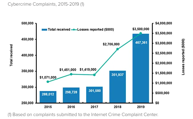
With the onset of the coronavirus pandemic, cyber crime evolved further. In a March 2020 public service announcement, the FBI warned of impending virus-related fraud schemes such as phishing emails from the CDC claiming to have information on the virus, and from other government institutions claiming to need personal information for stimulus checks. They also warned of online scams selling counterfeit personal protective equipment like N95 masks and gloves.
By May, the IC3 had already received around 320,000 fraud reports, close to 70% of the previous year’s total.
Because of all the risks that come with sharing personal information online, many people are careful about who they do business with. In particular, consumers are wary of purchasing from unfamiliar websites.
In one survey, 92% of U.S. consumers said they have concerns about sharing personal information when shopping on ecommerce websites they haven’t heard of before.
This presents a problem for ecommerce retailers, particularly for those who are just starting out and haven’t built brand recognition yet. If a visitor comes to your site for the first time and deems it too risky, they won’t become a customer. And after all the marketing effort that went into getting visitors on your site in the first place, that’s the last thing you want.
Assuming your goal is to convert as many visitors to your site as possible, it’s key that you develop customer trust.
Why is Customer Trust Important in Ecommerce?
When you walk into a brick-and-mortar store for the first time, you can identify definitive reasons to trust the business and feel comfortable shopping there right off the bat. You might see an employee at the register or stocking shelves, letting you know that there’s a person to talk to if you need help. You can physically touch the items for sale and inspect the quality before you decide to purchase. You might also see other customers shopping and making purchases, indicating that other people trust the business, too.
But the online shopping experience is different. You can’t see the people running the site, you can’t see if other people are shopping there, and your interaction with the products for sale is limited to photos, videos and written descriptions.
The lack of trust signals you’d see in person means there’s much more uncertainty when it comes to shopping online — and much more at stake. Will I receive my order as promised? Will they take my money and run? Will the quality of my purchase meet my expectations? Will my credit card be safe? Will my email be spammed? These are just a few of the many questions that may run through customers’ minds if they don’t fully trust an ecommerce website.
The Effects of Customer Distrust
With so many options easily accessible to them, online customers can simply abandon a questionable site in favor of one they trust more. And they do – nearly 70% of carts are abandoned on average.
The most common trust issue causing cart abandonment is the concern about business legitimacy, concerns about the security of credit card information and order fulfillment also top the list.
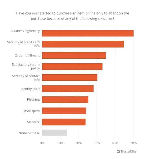
Abandoned carts unfortunately mean lower conversion rates, as well as wasted ad budget and marketing effort that was used to bring in visitors.
Beyond conversion issues, customer distrust can lead to negative reviews and word of mouth, both online and offline, which can be even more difficult to repair in the long run. With so many channels available for customers to report a poor experience, from social media to online reviews sites, negative perception of your brand can spread faster and reach more people than ever before.
Building Ecommerce Trust With Trust Signals
The in-person shopping experience has many more barriers to entry than the online shopping experience. You have to get in your car (hopefully your gas tank is full!), drive to a store (hopefully there’s no traffic!), and, if there’s a global pandemic going on, put your mask on before entering (hopefully you remembered to bring it!). After walking around the store, if you don’t like what you see, you now have to go somewhere else, and you’ve wasted time and effort.
The beauty of online shopping is that you can do it anytime, anywhere. You can hop around from site to site quickly and with nothing to lose. If you don’t like what you see, you can simply close the tab and move on.
Shoppers are now being even more selective than ever with their purchases. Since the pandemic, 41% of US consumers have become more mindful of where they spend their money to make sure that limited budgets are well spent. So if your site doesn’t make a good impression immediately, you’re at risk of losing out to another that does.
The good news is that trust signals can help you make that positive first impression. Trust signals are elements of a site that make customers feel reassured about their shopping experience. They indicate to the customer that the site is a legitimate business and reduce perceived risk of making a purchase. With trust signals, you can make up for the benefits of shopping in-store that would otherwise be missing from the online experience.
10 Trust Signals to Use on Your Online Store
When you sell things online, you’re expecting customers to trust that what they see is what they’ll get. Instead of asking them to do this blindly, you can include trust signals on your site to prove that your business is legitimate and secure. Here are 10 ways to incorporate trust signals in your online store to create confident and loyal customers.
1. Include customer reviews across your website.
Customer reviews can be effective trust signals for ecommerce.
No matter how great your product photos and descriptions might be, a first-time customer knows you have an incentive to sell and may suspect bias. Displaying customer reviews is a great way to say, “Don’t take our word for it; see for yourself what our customers think.”
This allows new buyers to verify your claims themselves — and often learn even more details along the way, like whether the color is the same in real life as it appears in the photo, if the product is made to last, or whether an item fits comfortably.
Ecommerce stores commonly include customer reviews on:
Product pages
Product category pages
Homepages
Reviews pages
Product pages are one of the most effective places to include customer reviews, because that’s where customers are looking to find details about individual products. A standard way to display them is to include the star rating near the top of the page and linking that to the full reviews section in a lower area, like Skullcandy does on their online store.


Including star ratings accumulated from customer reviews on product category pages can be helpful to customers because it gives them a quick side-by-side view of the most highly rated products.
Customer reviews and testimonials can also be displayed on homepages to help show first-time visitors that the site has a good reputation.
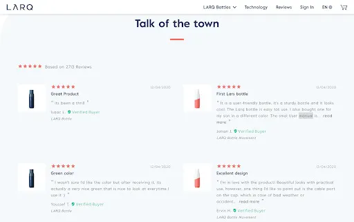
Standalone reviews pages are useful for ecommerce sites that have a limited product line, like LARQ water bottles. They have a reviews page linked in their site’s main menu, allowing customers to see the most recent reviews from verified buyers.
2. Make your return and exchange policy easy to find.
Because they can’t physically inspect products in person, one of shoppers’ big fears is that their online purchase won’t meet their expectations. A fair return policy can help eliminate some of the customer’s perceived risk of buying a product they haven’t seen before.
But you can’t alleviate that fear if customers don’t know about your return policy. If you only include the terms of returns on your FAQs or shipping policy page, you’re creating extra work for customers to find it. That’s not to say you shouldn’t include the information there, but you need to ensure that customers have easy access to it when they are in the heat of the decision-making process.
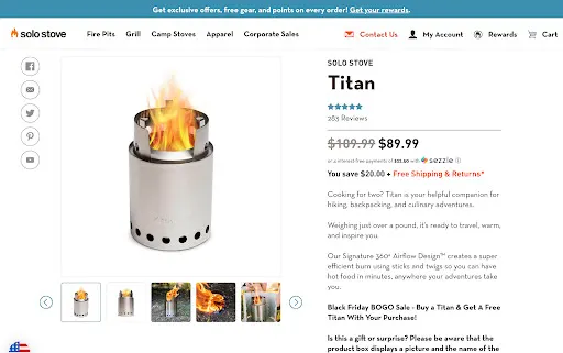
Give customers a push to click the add to cart button by including a snippet about your return and exchange policy on product pages, like Solo Stove does.
Tips for effective return and exchange policy placement
No need to go into detail when mentioning your return policy on product pages. You likely have product description copy taking up important real estate. Instead, use a short statement like “Free Shipping & Returns” (if returns aren’t free, include an asterisk). Make the statement clickable to open a module or page with the full details of the policy. Additionally, display the text in a color that stands out from the rest of the text on the page.
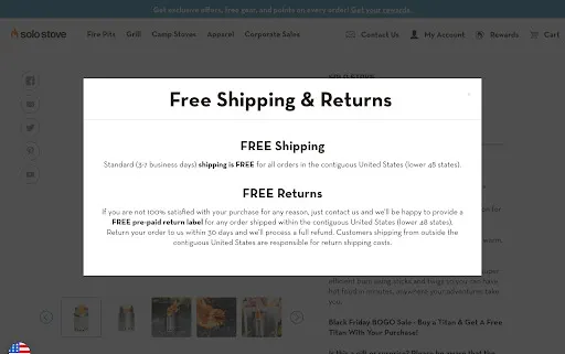
3. Display contact information.
How many times have you found yourself frustrated while shopping in a store because you couldn’t find a staff member to speak with when you have a question? Missing contact information on a website can make the online shopping experience just as frustrating, and some consumers even perceive that as a potential sign of fraud.
Making your site’s contact information readily available solves this problem by showing that there are real people behind the scenes who are easy to get in touch with.
At a minimum, ensure that your site’s header includes at least one contact method so that shoppers can easily find it no matter what page they’re on. Many sites include a link to a contact page, but displaying a phone number or email address can be a more direct way to build trust.
Red Stag Supplies displays their physical address in their site header, along with a contact email address, business hours, and a phone number that can be clicked to start a call.
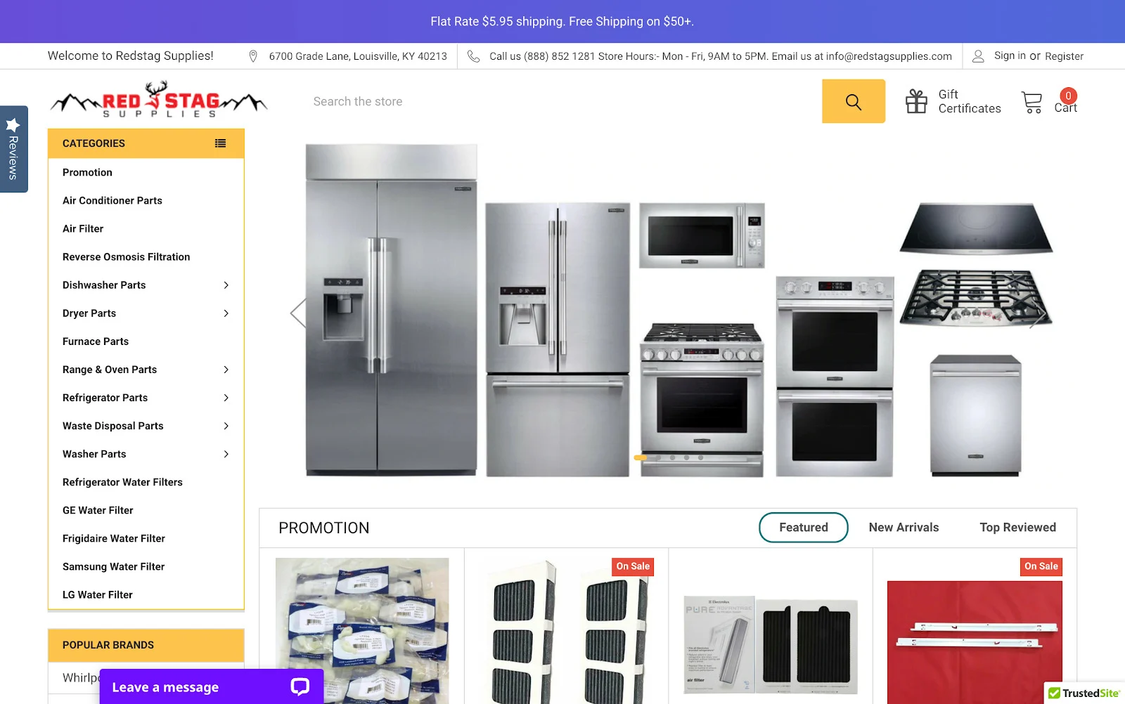
Tips for displaying contact information
When choosing a place to display contact information, don’t forget to consider how shoppers on mobile devices will find it. If you don’t have room for additional text in your mobile site header, include contact information in the menu.
Additionally, including a live chat is another great way to help customers get in touch with you. Give the live chat experience a personal touch by including the name and photo of the operating agent.
4. Add trust badges.
In the same way that restaurant grade signs displayed in shop windows show customers that an establishment meets government required safety standards, trust badges, also known as trust seals or trustmarks, show online shoppers that a website has been verified or evaluated by a third party.
There are a number of different ecommerce trust badge providers offering a range of verification services proving that a website:
Is a legitimate or accredited business
Does not contain viruses or malware
Collects and stores data securely with encryption
Does not send spam
Depending on the provider, your site may have to pass certain requirements before it can display those trust badges. Though it may require more effort on your part, it’s always better to use badges that your site has to earn because it shows visitors that you didn’t just pay for the right to display them.
Tips for adding trust badges to your ecommerce site
Choose a trust badge provider that helps you address a range of customer concerns, and display them throughout the customer journey on your site. TrustedSite offers a suite of certifications and trustmarks that are designed to be placed in the stages of the ecommerce journey where customers commonly drop off, like the shopping cart and checkout.
The Shoe Mart conducted an A/B test and found that TrustedSite trustmarks generated a 14% conversion lift over a competing badge.
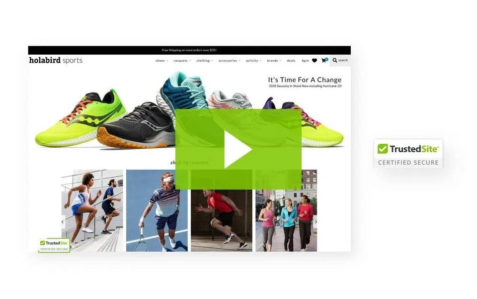
Be sure to use trust badges that are high resolution, easily recognizable to your visitors, and link back to the provider’s website to prove their authenticity.
5. Have an SSL certificate.
An SSL certificate is a global website security standard that enables encryption between a browser and server. It’s important to install an SSL certificate on your ecommerce site to ensure that when customers enter sensitive data, it’s transmitted securely, with less risk of being intercepted by a malicious attacker.

In 2018, Google Chrome began labeling any site not using an SSL certificate as “Not Secure.” When online shoppers see that red warning symbol in their browser, they lose trust in the website and are likely to abandon it. Ensure that customers see the secure lock symbol in their browser when shopping on your site by purchasing an SSL certificate.
Tips for getting an SSL certificate
SSL certificates can easily be purchased from a number of sources. You can even get one for free from Let’s Encrypt. Be sure to pay attention to the expiration date of your certificate. If it expires, your site will be marked as “Not Secure” until you renew or purchase a new certificate.
6. Design the site experience for the customer.
The user experience of your ecommerce website can make or break a customer’s decision to purchase. If they run into frustrating design roadblocks while perusing your site, customers will question the trustworthiness of your business. But if you design your site with the customer experience in mind, you can wow shoppers and keep them coming back for more.
Ensure your site doesn’t contain these design mistakes that can hinder the user experience and jeopardize conversion rates:
Slow-loading pages: Shoppers expect your site to load quickly. In fact, 53% of mobile visits are likely to be abandoned if pages take longer than 3 seconds to load. Optimize the performance of your pages so that customers can easily access your site without giving it a second thought.
Poor responsiveness: If your site isn’t as easy to navigate on mobile as it is on desktop, a large portion of visitors will be frustrated and discouraged from making a purchase. A mobile-first design approach is worth consideration.
Low resolution images: If your site displays images that appear grainy or unclear, visitors may question how professional your business really is. Using crisp, high resolution images will give your site a more polished look.
Tips for designing a great customer experience
Always keep in mind your customers’ goals and the hurdles they go through to achieve them. Revelry knows that brides and bridesmaids have tons of wedding planning to do, so they aim to make the dress shopping experience as efficient as possible. They offer a home try on service so that bridesmaids can be sure they are happy with the style and fit of their dress without any risk. They also have a “See Colors IRL” page that displays a feed of dresses photographed in different settings so that shoppers see the true colors before buying.

7. Provide detailed information in the product descriptions.
Having excellent product photography is important, but photos can only communicate so much information. You can’t look at a photo of a couch and determine if it will fit in your space. You can’t look at a photo of a bluetooth speaker and know if it’s compatible with your smartphone. Products descriptions allow you to fill in those gaps with the nitty gritty details so that customers can decide if your products fit their needs.
Burrow knows that one of the top priorities of their customers is to find furniture pieces that will fit in their home, so the first section of their product descriptions is devoted to dimensions. Following that, they go into more details about the piece and its key features. By addressing many of the concerns that come up when purchasing a new couch, Burrow helps customers build trust and gain the confidence to buy.
Tips for detailed product descriptions
You may find that your product descriptions end up quite lengthy once you start adding more details. To make the information easier to navigate, divide the copy into sections and include shortcut links to each so that shoppers can easily jump to the section that most interests them.

8. Include social media links.
Including links to your social media profiles is another great way to increase your credibility. When visitors view your social accounts, they can see your follower count which implies that other people are also interested in your business. If you’re actively maintaining your social channels, they’ll also see how your audience is engaging with you and get a sense of the attitude towards your brand.
The best place to display your social media links is in your site footer. Design the icons to match your site’s theme, instead of using the standard colors of each individual logo.
Tips for displaying social media links
Make sure that the social media accounts you link to are active. If customers see your last post was from 2 years ago, they may wonder if your business is still in operation.
9. Write a clear About Us page.
An About Us page gives you the opportunity to tell your customers who you are and what you stand for, and can encourage them to stay on site longer rather than leaving to do research elsewhere.
Spend time crafting the messaging on your About Us page so your brand’s voice really shines through. Include information about your company’s history, values, and any work you do in the community. Adding a bit about your employees and their roles is also a nice way to make your company seem more human. Ensure that your About Us page is linked in your main site navigation and footer.
Di Bruno Bros use their About page to share the story of their beginnings as a modest Italian market and inspire fellow cheese lovers with their passion for their craft.
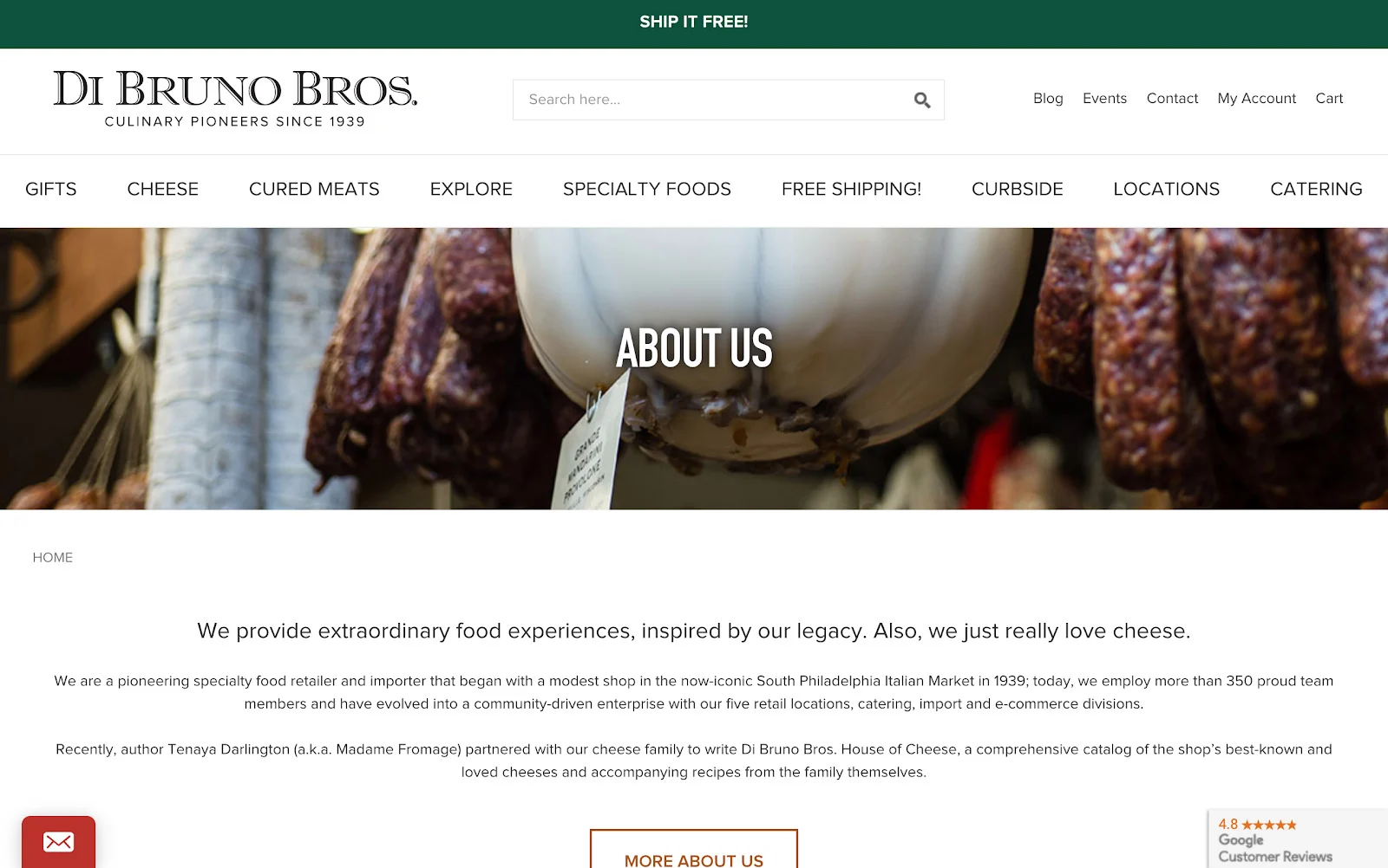
Tips for creating an about us page
Don’t forget to include photos! Photos from your company history and of your team will show visitors that you’re an authentic and transparent company worthy of their trust.
10. Keep your promises.
Offering a product guarantee or warranty can help customers feel more at ease purchasing from your site knowing that they can exchange or get a refund if they aren’t satisfied.
Whatever promise you make on your site, the most important thing is to keep that promise. Customers will be quick to write a negative review if they feel like you didn’t do what you said you would, which can damage your reputation and discourage new customers from trusting you.
Tips for keeping your promises
Don’t hide the details of your guarantees and other promises. Create a dedicated section of your help center or FAQ page that includes the fine print, and link to it whenever you mention the promise on your site. This way, customers won’t be upset or surprised to find out their purchase didn’t qualify for the guarantee.
Tips for Using Trust Signals Effectively
Adding trust signals to your site requires careful planning and consideration for them to be effective. Keep these tips in mind when working to build trust with your customers.
1. Be transparent about customer reviews and feedback.
Even if you have an outstanding product and exemplary service, it’s inevitable that you’ll receive negative customer reviews on occasion. It’s impossible to please everybody.
Your instinct may be to remove the negative reviews or comments, but that’s an untrustworthy practice that can actually backfire. If your site only displays positive reviews, customers may question the authenticity of the reviews and the credibility of your business.
Instead of deleting bad reviews, take the opportunity to demonstrate proactive customer service. If you made a mistake, own up to it and ask the customer how you can make it up to them. If there was a miscommunication, offer an apology and do what you can to resolve the issue. If the customer was actually in the wrong, thank them for their feedback. It’s always better to take the high road when it comes to customer service, just be sure to consider how you can prevent the situation from happening again in the future.
2. Moderation is key.
There is such a thing as too many trust badges, so be careful not to go overboard with placements. Displaying too many in one area can look cluttered and may cause visitors to doubt your site’s security or legitimacy.

Limit trust badges in any one area to no more than three, and make sure each trust badge is sending just one discrete message. For example, in the checkout, you may want to have one badge that addresses payment security, one that addresses your returns and exchanges policy, and one that addresses concerns about identity theft. Whenever possible, conduct A/B tests to ensure you’ve optimized trust badge placements for increased conversions.
Wrapping Up
Building trust on your ecommerce site doesn’t happen overnight. That’s because there’s no single plug-and-play solution that will address each and every concern of online shoppers.
When working to increase trust, it’s best to take a holistic approach. Put yourself in your visitors’ shoes and think about how they view your site at each stage of the customer journey. Use trust signals to address concerns as they arise and guide shoppers through each step.
With each trust signal they come across, customers will shop with confidence knowing that your site is legitimate, secure, and, if you play your cards right, not actually a cake.

There's a lot to love ❤️
Watch a demo to see the BigCommerce platform in action.


